 (No Ratings Yet)
In the days of PowerPoint 2003 and older versions, you just had to insert a chart to end up with a 3D chart! Yes, that’s true – and to say that this chart looks horrible is an understatement. Comparatively, the default column chart you add in newer versions of PowerPoint is so much more cleaner. Of course, changing the defaults does not mean that you will not encounter any 3D charts since even in newer versions.
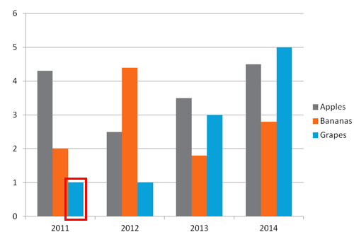
Learn why 3D charts may not be the best way to show your data.
Related Posts
 Waterfall charts are one of the most popular charts for displaying how different items come together to make up a whole. The chart was first invented ...
 Charts are something that are often shared between Excel and PowerPoint - and while Excel gurus may look down at PowerPoint as far as charting is conc...
 Did you read the title of this page correctly? Are we really suggesting that you should consider using a table rather than a chart? You might have hea...
 Imitation is the best form of flattery – and that motto will help you create charts that are so much better! Before we proceed, let us discuss whether...