 (No Ratings Yet)
Charts are a visual representation of data, and when seen on a PowerPoint slide from afar, you make out the value of a series by exploring where exactly it’s placed vis-à-vis the axis. Of course, if your chart has data labels, then this is less of an issue — however, typical charts have no data labels. For such a chart, you’ll find that Tick Marks placed on the axis will help us get a better idea.

Learn about the Major and Minor Tick Marks on Chart Axes in PowerPoint 2010 for Windows.
Related Posts
 In your chart, Axis Labels are the labels for the Categories and Values on chart axes. So where do these labels come from? Category axis labels reflec...
 While learning about chart axes, you will come across two terms, Major and Minor units. These are the intervals at which the axis spaces itself -- as ...
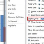
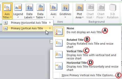 In a chart, the text used to label the chart axis is called Axis Title. All chart types other than Pie and Doughnut have axes -- and although Radar ch...
 Sometimes, your chart data values are not so much different from each other -- this results in a chart which doesn't help your audience to see any dif...