 (No Ratings Yet)
Charts that include elements spaced apart look better. You can increase the Gap width so that there is enough space between the categories. Also, you can adjust the space between the individual Data Series within a category. By default, charts in PowerPoint 2011 do not show any gap between the individual Data Series within a category.

Related Posts
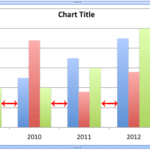 The Gap width within a chart is the space between two series points -- this by default is set to 150% of the width of individual Data Series (columns)...
 Patterns in PowerPoint are two-color designs that include lines, dots, dashes and checks. PowerPoint includes 48 such patterns with names such as 5%, ...
 There are various fills that you can apply to the Plot Area of a chart -- and a texture can often work surprisingly well. For those who want to know w...
 Picture fills can look great and distracting at the same time -- it all depends upon the type of picture you use for the fill -- and also what you fil...