 (No Ratings Yet)
It’s good to avoid using 3D charts unless your chart data requires a Z-axis. Having said that, we have chosen the topic of making your 3D columns in a chart transparent. Yes, there’s a reason to do so especially when you find that some of the columns in your 3D chart may be hiding behind one or more of the other columns, just because they are not tall enough. One easy solution for this problem is to reduce the opacity of the columns in the front.
![]()
Learn how to make 3D columns transparent for charts in PowerPoint 2013 for Windows.
Related Posts
 You can tweak your chart in PowerPoint as much as you want so that the resulting chart follows your specifications. Once you met a standard that you m...
 Even though charts are a visual medium, they still contain plenty of text in the form of data labels, titles, legend, axis labels, etc. Whenever you i...
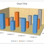 Unlike conventional 2D charts, 3D charts have distinct walls and a floor. Also, by default, these walls and floor show no fill and not even a border. ...
 In a 3D chart, when there are columns of various heights, it's possible that some of the taller columns hide other shorter columns placed behind them....