 (No Ratings Yet)
Even though charts are a visual medium, they still contain plenty of text in the form of data labels, titles, legend, axis labels, etc. Whenever you insert a new chart (or any other slide element), the default colors and fonts used are based on the active Theme of the presentation. In this tutorial you are going to learn how you can change the font and use other text options for charts in PowerPoint 2013.

Learn about formatting text within charts in PowerPoint 2013 for Windows.
Related Posts
 You can tweak your chart in PowerPoint as much as you want so that the resulting chart follows your specifications. Once you met a standard that you m...
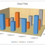 Unlike conventional 2D charts, 3D charts have distinct walls and a floor. Also, by default, these walls and floor show no fill and not even a border. ...
 In a 3D chart, when there are columns of various heights, it's possible that some of the taller columns hide other shorter columns placed behind them....
 It's good to avoid using 3D charts unless your chart data requires a Z-axis. Having said that, we have chosen the topic of making your 3D columns in a...