 (No Ratings Yet)
Making a chart look different translates to so much involvement. That’s because each chart has almost 10 or more elements that contribute to its appearance. Of course, you can format all these 10 elements individually, and end up spending some quality time exploring nuances that end up with some amazing and distinctive results. But what if you want the same format applied to another chart? The same format will be difficult to apply to any other chart because you will have to remember all the attributes you applied in the first chart—not to speak about the time it will take to create a coordinated chart. The savior, in this case, can be the amazing Chart Styles option in PowerPoint 2016.

Learn how to apply predefined Chart Style to your charts in PowerPoint 2016 for Windows.
Related Posts
 When you insert a new chart in PowerPoint, you might notice that an instance of the Excel sheet containing some dummy data for your chart pops up with...
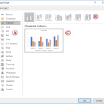 When you need to describe the relation between two or more sets of values in your presentation, charts are probably your best option. First of all, yo...
 Frankly, it has been many years since new chart types were added to PowerPoint’s repertoire of the ten chart types. The great news is that you will fi...
 You must pay attention to the position and alignment of slide objects on your PowerPoint slide, be it shapes or even the many inserted pictures. In th...