 (No Ratings Yet)
When a Column chart in PowerPoint contains only one Data Series and several Categories, then, by default the individual chart columns may use the same fill color. If your chart uses the same colored series in all of the categories, it can make your chart look dull (see Figure 2 later on this page) — it also does not provide a proper way for your audience to compare elements within the individual series.

Learn how to show different categories in different colors within a chart.
Related Posts
 The chart templates you save within PowerPoint 2013 are saved into a default folder location which you do not have to worry about, as far as you are u...
 You can tweak your chart in PowerPoint as much as you want so that the resulting chart follows your specifications. Once you met a standard that you m...
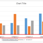 Even though charts are a visual medium, they still contain plenty of text in the form of data labels, titles, legend, axis labels, etc. Whenever you i...
 Unlike conventional 2D charts, 3D charts have distinct walls and a floor. Also, by default, these walls and floor show no fill and not even a border. ...