![]()
This is the print version of this page. All content is copyright Indezine.com 2000-2026.
![]()
Thoughts and impressions of happenings in the world of PowerPoint and presentations, continuously updated since 2003.
See Also:
PowerPoint and Presenting Notes
PowerPoint and Presenting Glossary
You can create the most amazing charts without any text since the main purpose of any chart is to show a trend. Having said that, text plays a very important role in charting — and although I do recommend you keep text at a minimum, you’ll end up with some text in the form of legend, some data labels, axis titles, or elsewhere. Nothing looks as bad as text that is too small or too huge on a chart, and balance plays a key role in the aesthetics of text in a chart. Yet many people don’t know how you can format text in a chart — this tutorial will get you started.
Learn more about working with text in PowerPoint charts.
Filed Under:
PowerPoint 2003
Tagged as: Charting, Fonts, PowerPoint 2002, PowerPoint 2003, Text, Tutorials
Comments Off on Learn PowerPoint 2003 for Windows: Changing Fonts and Other Text Options of Charts
 Sebastian Stein is the community manager of ARIS BPM Community, an online portal on business process improvements and management. He focuses on spreading the word about how pictures can help solving complex business problems without turning companies into bureaucratic monsters. Sebastian is an active blogger and writer. He holds a PhD in computer science.
In this conversation, Sebastian discusses the ARIS Express product, and how it can be used to create visual content for PowerPoint slides.
Geetesh: What exactly is ARIS Express, and why did you decide to give it away free?
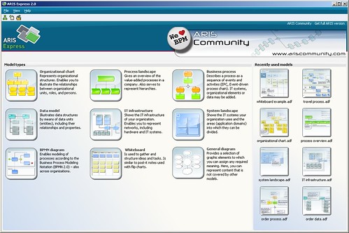
Sebastian: Well, ARIS Express is a free modelling tool targeting entry users, who never thought about using models to improve their business. There is a big pile of theory behind this business process management (BPM) topic, but in the end it boils down to the fact that a picture is worth a thousand words. So instead of writing several pages about the deficiencies e.g. of your hiring process, you just create a single picture using ARIS Express. Take this picture to discuss it with the involved people to find out why this process is e.g. running slow.
You can apply this idea of using pictures to analyze business problems in many situations. For example, with ARIS Express you can create organizational charts to clarify the power hierarchy or you use a network diagram to visualize your local IT infrastructure.
So why do we provide ARIS Express as freeware? Well, we at IDS Scheer are convinced that using pictures to solve business problems actually works. But we also know from our daily work with Fortune 500 companies that so far it is a technique mostly applied by large corporations. Tools are too expensive and too much knowledge is required to get started, preventing small companies to pick it up. We want to spread the word about BPM and bring it to smaller companies by providing a free tool plus free sample models. In the long run, we as a company will also benefit from more people adopting BPM.
Geetesh: How can PowerPoint users leverage the capabilities of ARIS Express in their slides – can you provide some examples?
Sebastian: We all have a story or two of really bad PowerPoint presentations. People tend to put up a lot of slides with a lot of bullet points. On the other hand, presentation experts tell us that we should focus on less. We should use pictures to illustrate our points instead of creating nested bullet point lists. Here, ARIS Express can be of great help. For example, you discuss how to use an external provider in your accounting process. Instead of describing the integration, create a process model showing the interaction between both parties. Or, use a data model while proposing which data to gather in your next mailing campaign. Again, a diagram with a fresh look will animate workshop participants to think instead of falling asleep. That’s the important point here, because you don’t get many chances to present your point.

Creating such diagrams is fairly easy if you combine PowerPoint and ARIS Express. Just quickly sketch the process in ARIS Express, copy the diagram to the clipboard and paste it in your PowerPoint slide. You can also export a diagram as Microsoft EMF file and add it to your PowerPoint slide or Microsoft Office document later on.
The views and opinions expressed in this blog post or content are those of the authors or the interviewees and do not necessarily reflect the official policy or position of any other agency, organization, employer, or company.
Filed Under:
Interviews
Tagged as: Graphics, Interviews, PowerPoint
Comments Off on ARIS Express: Conversation with Sebastian Stein
Although I mention that this tutorial works for both PowerPoint 2007 and 2010, the actual techniques work only within PowerPoint 2010. The reason why this does not work well within PowerPoint 2007 is because that version had no option for pattern fills — however if you work within PowerPoint 2010 using the procedure outlined on this page, you’ll find that any changes you make show up in PowerPoint 2007 as well.
Filed Under:
PowerPoint 2010
Tagged as: Charting, PowerPoint 2007, PowerPoint 2010, Tutorials
Comments Off on Learn PowerPoint 2007 and 2010: Changing Color for Negative Data Series in Charts
 Joerg Klueckmann studied Sociology, Business Administration, and Intercultural Communication at FSU, Jena, Germany, and LSU, Baton Rouge, USA. From 2000 to 2005, he was employed at Intershop Communications AG, where he was responsible for product marketing. In June 2005, Joerg Klueckmann joined IDS Scheer AG. Until 2010 he was responsible for ARIS Product Marketing, focusing on ARIS innovations. As Head of Marketing for the Process Intelligence Solution, he is currently in charge of marketing of all process intelligence and compliance products.
In this conversation, Joerg discusses ARIS MashZone, and how you can embed created mashups on web pages and PowerPoint slides.
Geetesh: What can a new business user unfamiliar with the mashing concept do with ARIS MashZone? How easy is it to get started and which scenarios can benefit?
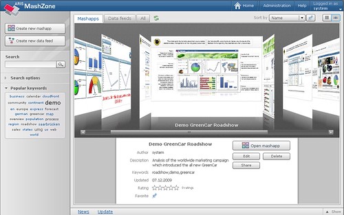
Joerg: ARIS MashZone enables everybody to create cool business mashups in minutes. The times that you have to wait for IT to provide you with customized dashboards are over. Now you just create them yourself the way you want them to be and pass them to your management, and believe me, they will be impressed. It is easy to start with MashZone. You can download a free version on www.mashzone.com The product comes with installed mashup examples for sales, marketing, HR, management, IT, controlling and leisure.
However, how do you create a mashup in MashZone?
Step 1: Obtain Data
You need to figure out which data you want to work with. Of course, you need the necessary rights to access the data. Then you should think about the KPIs you want to visualize in the mashup. MashZone supports CSV, XML, Excel, Open XML, ARIS PPM, and Web Services from Amazon, Google, Reuters, Yahoo etc . You can, of course, also use Excel-based SAP reporting to work with data from SAP systems, for example.
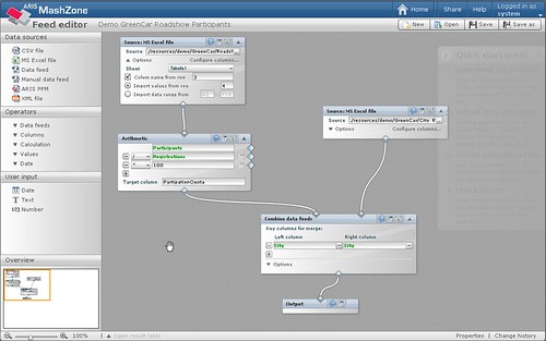
Step 2: Combine Data
Each data source can be a data feed. You can merge feeds, you can aggregate, apply arithmetic, etc. You can work with the data to get your desired results. MashZone has a feed editor which supports you to do so.
Step 3: Visualize Data
After you worked with your data feed, you need to visualize it. For this, MashZone has a Composer which provides you with a wide range of components, such as speedometers, charts, tables, traffic lights maps, etc.

Step 4: Share your Data
After you created your mashup you can easily share it throughout your organization. Others can either read it or, if they have the necessary rights, modify it, too. Data turns into transparent information and finally into knowledge.
Visit: www.mashzone.com to see ARIS MashZone in action. If you visit the gallery, you can open example mashups for all different use cases.
Have fun mashing!
Geetesh: Can I embed meshed dashboards created in MashZone on my web page or PowerPoint slide — can you provide some examples?
Joerg: MashZone is client-server based. This way your dashboard’s data is always up to date and reflect the latest updates made to the underlying data sources. Since its UI is Adobe Flex based MashZone is embeddable into other web pages easily. If PowerPoint is configured to embed Flash content you may even view your interactive dashboards right within your slides – and the best thing: you won’t lose any interactivity. All eye catching animations and graphic effects remain available.
The views and opinions expressed in this blog post or content are those of the authors or the interviewees and do not necessarily reflect the official policy or position of any other agency, organization, employer, or company.
Filed Under:
Interviews
Tagged as: Graphics, Interviews, PowerPoint
 Jagdeep Singh Pannu handles Internet marketing for authorGEN’s Web properties, tweets friendly advice, likes green tea, and gets excited about meeting netizens in person.
In this conversation, Jagdeep discusses the new authorSTREAM iPad Contest.
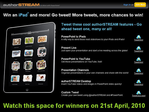
Geetesh: Tell us more about the authorSTREAM iPad contest, and how this creates a buzz with the audience?
Jagdeep: The iPad contest is a medium to extend authorSTREAM to PowerPoint users. We are asking our users to tweet what they like about authorSTREAM. By using the #PowerPoint tag, these tweets get listed in the PowerPoint search on Twitter. PowerPoint users who do not know about authorSTREAM will get feature recommendations from our members, which in turn will enable them to explore our features and do more with PowerPoint. To facilitate this, we have listed some of our features and have preset them as tweets so that members can choose the one they like and simply click and tweet. We have also provided a custom tweet option, where members can choose to create their own tweet, provided it has @authorSTREAM and #PowerPoint in the message.
Geetesh: I see that you are asking users to tweet about several cool authorSTREAM features – tell us about the interesting ways in which people are tweeting about these?
Jagdeep: Yes, and we want that people tweet only about features that they know about and like. I would like to bring attention to a very important rule here:
You can choose to tweet one of the features above or you can tweet a message using both – @authorSTREAM and #PowerPoint. We suggest you tweet only about the features that you like on authorSTREAM and you honestly want that your followers should be informed about those features.
And we do see that a lot of people are using their creative skills to tweet. Some of the tweets show how members love using PowerPoint as a presentation tool and authorSTREAM as a platform for sharing and adding functionality to their presentations. Some tweets also show how they have been using PowerPoint and authorSTREAM. Here are some interesting tweets that came in:
The views and opinions expressed in this blog post or content are those of the authors or the interviewees and do not necessarily reflect the official policy or position of any other agency, organization, employer, or company.
Filed Under:
Interviews
Tagged as: authorSTREAM, Contest, Interviews, Online Presentations, PowerPoint, Twitter
Microsoft and the Office logo are trademarks or registered trademarks of Microsoft Corporation in the United States and/or other countries.