 (No Ratings Yet)
When a new chart is inserted in your PowerPoint presentation, you will find that it takes the fills and border types based on the Theme of your presentation. You can change the fills and borders of charts as required. Other than that, you can always use pictures as fills. For example, imagine a chart that shows fruit exports and each column of the chart is filled with pictures of a particular fruit type rather than the conventional solid color fills or geometric patterns? Also, if you wanted to show how the export of grapes has increased over the years, your column chart would have all columns filled with pictures of grapes stacked one over the other? In PowerPoint 2011, you can always do just that with your charts as explained in this tutorial!

Related Posts
 Charts that include elements spaced apart look better. You can increase the Gap width so that there is enough space between the categories. Also, you ...
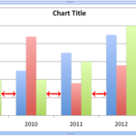 The Gap width within a chart is the space between two series points -- this by default is set to 150% of the width of individual Data Series (columns)...
 Patterns in PowerPoint are two-color designs that include lines, dots, dashes and checks. PowerPoint includes 48 such patterns with names such as 5%, ...
 There are various fills that you can apply to the Plot Area of a chart -- and a texture can often work surprisingly well. For those who want to know w...