 (No Ratings Yet)
Charts are a visual representation of data, and when seen on a PowerPoint slide from afar, you make out the value of a series by exploring where exactly it’s placed vis-à-vis the axis. Of course, if your chart has data labels, then this is less of an issue — however, typical charts may have no data labels. For such a chart, the Tick Marks placed on the axis will help us get a better idea. Most chart types show two types of tick marks on axes — Major and Minor.

Learn about the Tick Marks, both Major and Minor on chart axes in PowerPoint 2011 for Mac.
Related Posts
 Charts that include elements spaced apart look better. You can increase the Gap width so that there is enough space between the categories. Also, you ...
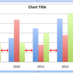 The Gap width within a chart is the space between two series points -- this by default is set to 150% of the width of individual Data Series (columns)...
 Patterns in PowerPoint are two-color designs that include lines, dots, dashes and checks. PowerPoint includes 48 such patterns with names such as 5%, ...
 There are various fills that you can apply to the Plot Area of a chart -- and a texture can often work surprisingly well. For those who want to know w...