 (1 votes, average: 5.00 out of 5)
Let’s imagine that you need to create a chart from data where values are not too different. Our sample data explores how people of different age brackets choose their favorite colors. If you look closely at the data, you will realize that all values span from between 285 and 365. Essentially, it makes no sense to even discuss any value lower than 250 or above 370 for this data set. Yet when you create sample column and bar charts from this data using PowerPoint’s defaults, you’ll end up with a column chart that shows columns that are very similar in their heights — there really is no contrast highlighting the findings of our data. It’s the same story with bar charts where the bars look almost similar.

Learn how to set the Minimum and Maximum values on Value Axis of Charts in PowerPoint 2011 for Mac.
Related Posts
 Charts that include elements spaced apart look better. You can increase the Gap width so that there is enough space between the categories. Also, you ...
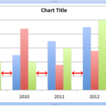 The Gap width within a chart is the space between two series points -- this by default is set to 150% of the width of individual Data Series (columns)...
 Patterns in PowerPoint are two-color designs that include lines, dots, dashes and checks. PowerPoint includes 48 such patterns with names such as 5%, ...
 There are various fills that you can apply to the Plot Area of a chart -- and a texture can often work surprisingly well. For those who want to know w...