![]()
This is the print version of this page. All content is copyright Indezine.com 2000-2026.
![]()
Thoughts and impressions of happenings in the world of PowerPoint and presentations, continuously updated since 2003.
See Also:
PowerPoint and Presenting Notes
PowerPoint and Presenting Glossary
We showed you how you can add a basic Motion Path animation to any PowerPoint slide object. If none of the ready-made motion paths suit your needs, or if you cannot easily edit them to the way you want, you can easily create your own motion paths. In this tutorial, we’ll show you how you can use PowerPoint’s drawing tools to create your own motion path.
Learn how to draw a custom path in PowerPoint 2010 for Windows.
Filed Under:
PowerPoint 2010
Tagged as: Animation, PowerPoint 2010, Tutorials
Comments Off on Learn PowerPoint 2010: Motion Path Animations — Drawing Custom Paths

Dag Hendrik Lerdal is a 29-year old entrepreneur and Software Engineer with an MSc in Communication Technology living in Trondheim, Norway. After finishing his Master’s degree at the Norwegian University of Science and Technology, he co-founded Preseria AS in 2008. The company develops technology and services related to planning, administration, execution and publishing of digital presentations in context of seminars, meetings and conferences. Learn more about Dag from his LinkedIn profile.
In this conversation, Dag discusses the new SlideDog site.
Geetesh: What is SlideDog, and what motivated you to create this product?
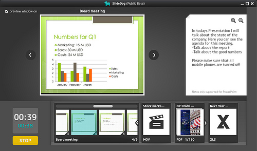
Dag: SlideDog is a multimedia presentation player for speakers, event organizers and meeting planners. It enables you to seamlessly switch between presentation files such as PowerPoints, PDFs, movies, images, web-pages, Prezis, and other documents. SlideDog features a simple user interface where you simply drag your files into a playlist and organize them according to your presentation or event. SlideDog will launch the files in the playlist in fullscreen without displaying the computer desktop or application specific loading screens to the viewers, enabling smooth transitions between files and presentations. SlideDog uses a PowerPoint like multi-monitor output to provide meta-information to the speaker. It is able to show a normal presentation window on one screen, while showing a more sophisticated overview on the other one providing information like thumbnails of the next slides, slide notes and timers. Soon you’ll also be able to use your smart phone to control SlideDog remotely and view presenter notes directly on your phone.
About what motivated us to create this project — it was first and foremost, all the unnecessary delays we experienced as university students during various meetings, seminars, and group presentations. Meeting leaders and presenters rarely had a good routine for switching between speakers or different types of presentation files. We often saw lecturers showing their cluttered desktop and personal desktop background to the whole audience. The focus was immediately drawn away from the presentation and instead towards the funny dog on his or her desktop. After seeing these things happen countless number of times, we thought that there had to be an easy way to do this more professional and seamlessly. We did some research and except for expensive hardware solutions using advanced switches and multiple computers, we didn’t find anything good, so we decided to make something ourselves.
Geetesh: How much will SlideDog cost when it is out of beta, and do you want to share any user feedback?
Dag: We haven’t decided the pricing model just yet, but SlideDog will likely come in a free and a Pro version. The Pro version will cost about $99 for a single computer license. Some users have already requested online and collaborative features, and if we decide to implement this, the pricing model might also include a subscription based fee.
We’ve gotten a lot of positive feedback since we launched last Friday. People have e-mailed us and told us that they are going to start using SlideDog regularly in their lectures. We have a couple of firms who are already using it at their board meetings to be more effective and we’ve also gotten a couple of very useful bug-reports that we are working hard to fix until the next release. A lot of people seem to want a Mac version, and we hope to get this done by the time we’re out of beta.

You can download the latest SlideDog beta here.
Filed Under:
Interviews
Tagged as: Interviews, Online Presentations, PowerPoint
Comments Off on SlideDog Beta: Conversation with Dag Hendrik Lerdal
If you want to add some visual content to your presentation slide, adding pictures is a great way to get started. There are two ways to insert a picture on your slide in PowerPoint. You use a layout that includes a content placeholder, or you insert a picture within a slide irrespective of its layout. Whichever option you choose depends upon your choice — we cover both of them in the following steps.
Learn how to insert a picture on a slide in PowerPoint 2011 for Mac.
Filed Under:
PowerPoint 2011
Tagged as: Office for Mac, Pictures, PowerPoint 2011, Tutorials
Comments Off on Learn PowerPoint 2011 for Mac: Insert Picture
 Melissa Marshall is a faculty member at Penn State University in the Department of Communication Arts & Sciences where she teaches scientific presentation skills to engineering students. She is a crusader against bullet points and an evangelist for effective slide design. Along with her colleague Michael Alley, Melissa provides guest lectures and workshops on the Assertion-Evidence slide design all over the world. You can learn more about Melissa here.
In this conversation, Melissa discusses how you can effectively design scientific slides.
Geetesh: Tell us about the presentation slides you are involved with as part of your work, and are medical and engineering slides really different than other conventional slides?
Melissa: Because of the level of technical content in most science and engineering presentations, it is critical to have presentation slides that help an audience to understand, remember, and appreciate the importance of the work being presented. Unfortunately, the typical, commonly used design of PowerPoint slides is primarily text-based with a phrase title supported by a bulleted list. As presenters, we can do better!
When a speaker uses text heavy slides, this can lead to cognitive overload of the audience (otherwise known as Death by PowerPoint). There is a limit to how much words-based information your audience can process. Whether words are spoken or written on a slide, it is verbal information that is processed in the same part of the brain. And since a talk itself is composed of spoken words, when a presenter has slides that are also primarily text, this causes the audience to be overwhelmed with verbal information, so they will often only read the slides or only listen to the presenter which is evidence of cognitive overload. Additionally, bullets do not show connections or relationships of the content being presented. As a result, it is very difficult for the audience to determine the most important information on the slide. This issue is magnified in a technical presentation that contains challenging content that an audience has to work hard to understand. Due to the challenges of communicating about technical ideas, it is essential that scientists and engineers design their slides to make their content most easily understood by their audience.
The Assertion-Evidence slide design utilizes several important principles of how people learn to allow presenters to create slides that help an audience to understand and remember the content. The Assertion-Evidence slide design is characterized by a concise, full-sentence assertion at the top of the slide that communicates the main message of the slide. This assertion is then supported on the body of the slide by visual evidence, instead of a bullet list. Visual evidence can be photos, drawings, diagrams, graphs, films, or equations.
The short, full sentence assertion leads to more clarity and focus in a presentation. When a presenter carefully considers the key message of each slide and communicates that message in a full sentence, this causes the speaker to emphasize the most important details of the work being presented. Most presenters put a phrase at the top of a slide like “Results”. Unfortunately, this does not provide much of a filter, so presenters will often then crowd the slide with too many details that are related to “Results”. Instead, if the presenter states at the top of the slide what the audience should know about “Results”, they might write on assertion like “A higher weight percentage of Nickel results in higher resistance to corrosion.” This causes the slide to be more focused and allows the audience to very quickly hone in on the most important take away. And, if the audience gets a bit confused, a well-crafted assertion will provide a life line that will get them back on the path of the talk.
The second key step is to support the assertion with visual evidence. This is the most powerful feature of this strategy. It should be the goal of a presenter to use their slides to do something for them that the words they are saying cannot. That means that presenters need to maximize the visual components of their slides and limit the use of words. Visual information is processed in a different part of the brain, and is often much more memorable to an audience. And, as human beings, we know this to be true as illustrated by the common saying “A picture is worth a thousand words.”
It is important that the visual evidence presented is a relevant, quality visual—clip art will not suffice. Excellent options include: photos, drawings, diagrams, graphs, films, tables or equations. Speakers should not be afraid to use the tools of PowerPoint to draw their own visuals, if they are not able to find something that already exists to show their concept. If you can picture it in your head, you can often make it yourself–and you don’t need to be a computer wizard to do so. When the body of your slide is primarily visual, you as a speaker become a “tour guide” for the slide. You point out what the audience should notice about a particular graph or image or the areas that are notable or important. The end result is that both the speaker and the audience are more engaged and connected throughout the presentation.
Here are two strong examples of Assertion-Evidence slides:

Figure 1: Slide by Kathryn Kirsch, researcher in Mechanical Engineering at Penn State University.

Figure 2: Slide by Genevieve Brown, researcher in Bioengineering at Columbia University.
Examples, templates, and further discussion of the Assertion-Evidence design can be found on the website Rethinking the Design of Presentation Slides managed by my colleague, Michael Alley, author of The Craft of Scientific Presentations and originator and developer of the research on the Assertion-Evidence slide design.
Discussion, tips, and examples for effective scientific presentations can be found on my site Effective Presentations in Science and Engineering.
Geetesh: You mention on your site that “science not communicated is science not done” – love that quote! Tell us more about your thoughts that framed this quote.M
Melissa: Much of the future health, happiness, and safety of our world will depend upon the innovations of scientists and engineers. In order for a breakthrough in the lab or a creative design idea to gain support, it has to be communicated in a way that an audience outside of the lab or design firm can understand and appreciate the significance of the project or findings. Often, the decision makers who will impact whether a project will gain funding or move forward are executives, managers, government officials, or even the general public. These audiences often do not have the same technical background, so it is imperative that scientists and engineers can communicate the significance of their work in order for it to succeed. If you have an incredible result in the lab, but are unable to clearly establish the significance of that finding to a broader audience and it is ignored instead of advanced, then the work has not been successful.
In order for science to have an impact, it has to be communicated. One area where we are seeing great advancements in communication of technical ideas is through TED. TED stands for Technology, Entertainment, and Design and is committed to finding and sharing “Ideas Worth Spreading”. And they spread those ideas through short, very well-done presentations. TED is creating a platform for many important ideas in science and engineering to be communicated to the world and the speakers are really stepping up to the challenge. I encourage you to check out some of the presentations on TED and see what you can learn about your own speaking from these examples. And it is worth noting that you almost NEVER see text filled, bulleted slides from TED speakers.
Good scientific presentations take time to prepare, but they are worth it. The research matters and deserves to be presented in a way that will allow an audience to see its significance. Critical thought into slide design is a great first step.
The views and opinions expressed in this blog post or content are those of the authors or the interviewees and do not necessarily reflect the official policy or position of any other agency, organization, employer, or company.
Filed Under:
Interviews
Tagged as: Design, Interviews, PowerPoint, Presentation Skills
Comments Off on Scientific Presentations: Conversation with Melissa Marshall
Motion path animations in PowerPoint enable you to make any slide object move into or off the slide, and also make it move around on the slide in a particular path! PowerPoint provides dozens of motion paths, in every shape that you can imagine. To add a Motion Path animation to any object on a PowerPoint slide, follow these steps.
Learn how to apply Motion path animations to slide objects in PowerPoint 2010 for Windows.
Filed Under:
PowerPoint 2010
Tagged as: Animation, PowerPoint 2010, Tutorials
Comments Off on Learn PowerPoint 2010: Motion Path Animations — Getting Started
Microsoft and the Office logo are trademarks or registered trademarks of Microsoft Corporation in the United States and/or other countries.