 (No Ratings Yet)
If your chart data values are not so much different from each other, the chart created using this data will not help your audience to differentiate the series representing those values. Our sample data explores how people of different age brackets choose their favorite colors. If you look closely at the data, you will realize that all values span between 285 and 365. So, it makes no sense to even discuss any value lower than 250 or above 370 for this data set.

Related Posts
 You can tweak your chart in PowerPoint as much as you want so that the resulting chart follows your specifications. Once you met a standard that you m...
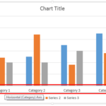 Even though charts are a visual medium, they still contain plenty of text in the form of data labels, titles, legend, axis labels, etc. Whenever you i...
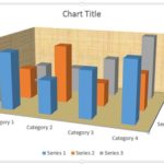 Unlike conventional 2D charts, 3D charts have distinct walls and a floor. Also, by default, these walls and floor show no fill and not even a border. ...
 In a 3D chart, when there are columns of various heights, it's possible that some of the taller columns hide other shorter columns placed behind them....