
This is the print version of this page. All content is copyright Indezine.com 2000-2026.
Thoughts and impressions of happenings in the world of PowerPoint and presentations, continuously updated since 2003.
See Also:
PowerPoint and Presenting Notes
PowerPoint and Presenting Glossary
It’s true that there are several amazing examples of PowerPoint usage that up the ante on what you can do with slideware — and it is equally true that the slides that most presenters come up with do almost nothing to help their presentations since these slides tend to confuse rather than help an audience.
That’s the reason why Jean-luc Doumont’s podcast on Creating Effective Presentations provides you with several interesting observations. Although Doumont has not come up with something I haven’t heard before, the fact that he explains this so well, and in such a small podcast is something I’ll call awesome.

Hear and download the podcast here.
Filed Under:
Case Studies
Tagged as: Case Studies, Podcast, PowerPoint
Comments Off on Creating Effective Presentations: A Podcast
SmartDraw today announced that Virginia Tech has selected SmartDraw software for business graphics. According to Phil Lambert, Technology Business, and Contract Analyst with Virginia Tech, SmartDraw will be available university-wide to help faculty, staff, and students create polished, professional charts and graphics in minutes.

Filed Under:
Presentation Bank
Tagged as: Business, Graphics, SmartDraw
Comments Off on SmartDraw for Business Graphics
The folks at PC World recently created the same presentation in both PowerPoint 2008 for the Mac and Apple’s Keynote 08 — the results make interesting reading. There’s no clear winner, but PowerPoint 2008 may have surpassed Keynote 08 in several areas.
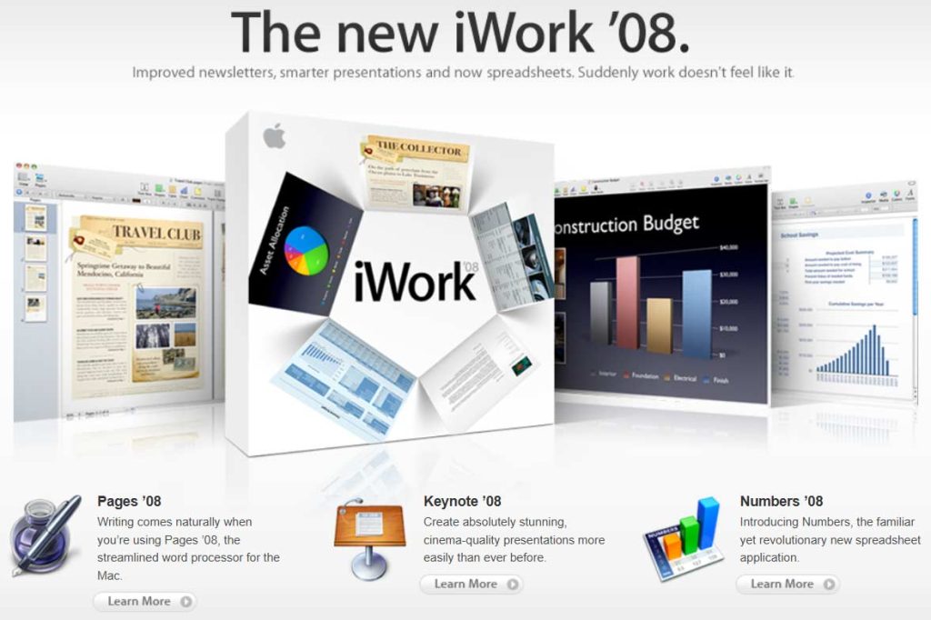
Read more on the PC World site.
Filed Under:
Keynote
Tagged as: Keynote, Office for Mac, PowerPoint, PowerPoint 2008
Comments Off on PowerPoint 2008 or Keynote 08

Christian Lund-Sørensen is co-owner and serves as Managing Director at SkabelonDesign. He is responsible for all international activities in the company and also focus on strategic development of the company. Prior to joining SkabelonDesign, he careered in the media business serving as sales executive and strategic analyst. Christian is a PowerPoint utility expert and has advised a large number of global companies in productivity optimization and brand control in PowerPoint. Apart from SkabelonDesign Christian is co-owner in two other Danish software companies.
Filed Under:
Interviews
Tagged as: Add-in, Christian Lund, Interviews, Omnidocs, PowerPoint
Comments Off on The Christian Lund-Sørensen Interview

Echo Swinford is a Microsoft PowerPoint MVP (Most Valuable Professional). When she’s not working on new media, she is answering almost all the questions on the PowerPoint newsgroup. Echo is also the co-author of Microsoft Office PowerPoint 2007 Complete Makeover Kit, published by Que. She also creates tons of presentations for the medical industry. You can contact her for your presentation requirements through her site, Echo’s Voice.
Geetesh: Tell us more about yourself and the PowerPoint work you do in the medical industry.
Echo: Well, I started working for a medical education communications company in 1997. The owner was considering outsourcing her slide work, but she was worried about quality control. I knew my quality control was good in general, so I proposed that she let me create her slides. I didn’t tell her that I didn’t really know PowerPoint, so when she agreed, I had to learn it, and learn it fast!
I think my background in journalism and desktop publishing has really helped me with slide development, especially if you think of it as page layout on a large scale. I know that my proofreading skills are a definite plus, and the fact that I’m a bit of a math and puzzle geek sure hasn’t hurt!
Here I am, 11 years later, still developing presentations for a variety of industries. In the healthcare and medical education industry specifically, I do a lot of slide cleanup work, making presentations consistent and visible for conferences and meetings, as well as developing collateral materials like scientific posters and syllabi. I also do a lot of promotional decks, speaker-led presentations, CME materials, and stand-alone enduring education modules that are distributed in a variety of ways. In addition, I can often be found with the production crew backstage at meetings, running speaker reviews, or minding the presentation equipment. I love being self-employed, so I have the opportunity to do all of those things and more (like writing PowerPoint books!).
Geetesh: What sets the presentations created for medicine to be different than conventional PowerPoints?
Echo: Honestly, I don’t know that there is such a thing as a “conventional” PowerPoint! PowerPoint is used in so many ways….
One thing common to many medical presentations, though, is the sheer amount of data-driven slides. That means lots of charts, lots of tables, and lots of really text-heavy slides. I find that the extreme mix of chart slides is always a challenge in medical presentations – more so than with what I see in other industries. For example, it’s not unusual for a medical presenter to want four or six very small charts on a slide, with the goal of comparing various studies or compounds at different stages. Therefore, understanding what point the speaker wants to make becomes imperative to the design of the slide. If you can eliminate or at least downplay the extraneous information, you can emphasize what’s important – what the audience should remember.
So, maybe after this four-chart slide, there’s a column chart. Then a line chart, then a pie chart, then a column chart with a trend line. Some have error bars, and some don’t. Some slides have two or three or four charts, while others have just one. The challenge is making all of these different charts look like a cohesive set, especially when the data varies so greatly. It’s also important to understand what types of charts show what types of data the best, so you can advise your clients appropriately.
When you toss in text-heavy slides, it’s important for the presentation developer to understand what’s important and what can be moved into speaker notes or downplayed on the slide. Some text slides work better as tables, especially if the text has lots of numbers and specific data.
And then, of course, there’s always the struggle with where to place references, P-values, and acronym definitions, and it’s not unusual to have a lot of all of those on an individual slide! That extreme amount of “fine print” just isn’t as much of an issue in the presentations I work on for other industries. And finding some of the symbols used in medical presentations can be an adventure, too.
The views and opinions expressed in this blog post or content are those of the authors or the interviewees and do not necessarily reflect the official policy or position of any other agency, organization, employer, or company.
Filed Under:
Interviews
Tagged as: Echo Swinford, Interviews, Medicine, PowerPoint
Comments Off on Medicine Presentations: Conversation with Echo Swinford
Microsoft and the Office logo are trademarks or registered trademarks of Microsoft Corporation in the United States and/or other countries.