
This is the print version of this page. All content is copyright Indezine.com 2000-2026.
Thoughts and impressions of happenings in the world of PowerPoint and presentations, continuously updated since 2003.
See Also:
PowerPoint and Presenting Notes
PowerPoint and Presenting Glossary

Arpit Dhariwal is a Senior Product Manager at SlideShare, leading the content acquisition team. The team is committed to offering multiple ways to share ideas and expertise of users with fellow professionals through SlideShare. Prior to joining LinkedIn in 2012, Arpit worked with multiple internet and technology companies. Arpit has a B.Tech from Dhirubhai Ambani Institute of Information & Communication Technology and an MBA from S.P. Jain Institute of Management & Research.
In this conversation, Arpit discusses SlideShare’s slide creation options.
Filed Under:
Interviews
Tagged as: Interviews, Online Presentations, PowerPoint, SlideShare
Comments Off on Creating Slides on SlideShare: Conversation with Arpit Dhariwal
If your chart data values are not so much different from each other, the chart created using this data will not help your audience to differentiate the series representing those values. Our sample data explores how people of different age brackets choose their favorite colors. If you look closely at the data, you will realize that all values span between 285 and 365. So, it makes no sense to even discuss any value lower than 250 or above 370 for this data set.

Filed Under:
PowerPoint 2013
Tagged as: Charting, Design, PowerPoint 2013, Tutorials
Comments Off on Learn PowerPoint 2013 for Windows: Set Minimum and Maximum Values on Value Axis
This week we bring you an exclusive tutorial from Taylor Croonquist on creating a waterfall chart in PowerPoint. PowerPoint 2013 users can learn more from a bunch of Photo Album tutorials. Users of PowerPoint 2011 for Mac will learn about playing sounds across successive slides.
And don’t miss the new discussions and templates of this week!

Read Indezine’s PowerPoint and Presenting News.
Filed Under:
Ezine
Tagged as: Ezine, Indezine, News, PowerPoint
Comments Off on PowerPoint and Presenting News: November 25, 2014
The text used to label the chart axes in a chart is called an Axis Title. All chart types other than Pie and Doughnut have axes — and although Radar charts have an axis, there is no provision to add Axis Title for them. In all other chart types such as Column, Line, etc., Axis Titles are not visible by default.
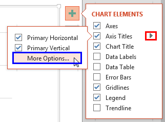
Learn how to add and edit Axis Titles in PowerPoint 2013 for Windows.
Filed Under:
PowerPoint 2013
Tagged as: Charting, Design, PowerPoint 2013, Tutorials
Comments Off on Learn PowerPoint 2013 for Windows: Axis Titles
A Chart Title of course is something that describes your chart. And PowerPoint charts do have an option to use a placeholder to contain this Chart Title. However, before you go ahead and use this option, you must decide if you need this Chart Title placeholder or not. Here are some guidelines that will help you make that decision.

Learn how to add a Chart Title in PowerPoint 2013 for Windows.
Filed Under:
PowerPoint 2013
Tagged as: Charting, Design, PowerPoint 2013, Tutorials
Comments Off on Learn PowerPoint 2013 for Windows: Chart Title
Microsoft and the Office logo are trademarks or registered trademarks of Microsoft Corporation in the United States and/or other countries.