 (No Ratings Yet)
Have you seen charts that were not filled with solid color fills or geometric patterns, but rather with pictures? For instance, if you wanted to show how the export of grapes has increased over the years, your column chart would have all columns filled with pictures of grapes stacked one over the other? The good thing is that PowerPoint allows you to do just that within your charts — as long as you know which options you need to change — and that’s explained in this tutorial!
Related Posts
 You can create the most amazing charts without any text since the main purpose of any chart is to show a trend. Having said that, text plays a very im...
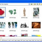 In previous tutorials, we have covered solid, gradient, texture and pattern fills for AutoShapes in PowerPoint 2003 or earlier versions. In this tutor...
 Other than solid fills and gradient fills, PowerPoint 2003 for Windows and previous versions also include three other fill types: textures, patterns, ...
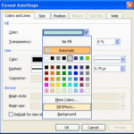 Patterns in PowerPoint are two-color designs comprising patterns like lines, dots, dashes, and checks. PowerPoint includes 48 patterns, such with name...