![]()
This is the print version of this page. All content is copyright Indezine.com 2000-2026.
![]()
Thoughts and impressions of happenings in the world of PowerPoint and presentations, continuously updated since 2003.
See Also:
PowerPoint and Presenting Notes
PowerPoint and Presenting Glossary
Duplicating a Slide Master is a little different than adding a new Slide Master from scratch. And it’s a smart option because you don’t have to make the same changes all over again — let’s explain this with a scenario. Imagine you have formatted your existing Slide Master by applying a Background Style, adding a logo, or even adding your own Picture placeholder layout. And now you want a new Slide Master that’s almost the same as your existing one — but you want a different Theme Colors set to be used. For such a small change, it is advisable that you duplicate your existing Slide Master and make the small changes instead of starting all over again with a new Slide Master.

Learn how to duplicate Slide Masters in PowerPoint 2010 for Windows.
Filed Under:
PowerPoint 2010
Tagged as: Masters, PowerPoint 2010, Templates, Tutorials
Comments Off on Learn PowerPoint 2010 for Windows: Duplicate Slide Masters
 Jim Confalone is a partner and creative director with ProPoint Graphics and is responsible for production operations. With a background in fine arts, he got his start as a designer leading the graphics department at a boutique management consulting firm in Boston, Massachussetts. Prior to ProPoint, he also worked as a web, Flash, and graphic designer in the New York area. Mr. Confalone holds an MFA with Honors in Painting and Printmaking from the Rhode Island School of Design and a BA Summa Cum Laude in Fine Arts from Amherst College.
In this conversation, Jim talks about ProPoint’s Evolution of Business Presentation Technology graphic.
Geetesh: Your Evolution of Business Presentation Technology infographic goes back 2 centuries – how has presenting been the same during these two hundred years, and how has it been different?
Jim: The purpose of presentations hasn’t changed — they are still intended to inform, educate and persuade. What also hasn’t changed is presenters’ recognition of the importance of visuals to help them deliver powerful, engaging presentation, and also to help them communicate their message effectively.

Full graphic can be seen here.
Whether using a blackboard, magic lantern, or transparency projector, until recently the purpose of the delivery method has generally been to illustrate on large scale the core message of a presentation. What’s really fascinating are the new opportunities afforded by the growth of multimedia, online and interactive tools. Instead of just throwing something on the wall, you can now directly involve your audience on a whole new level with things like supporting video or animation, online links to external sources, or real-time interactive polling. And whenever you can make a direct connection to your audience your job becomes a whole lot easier.
Geetesh: Tell us about this infographic – why you created this, and was it fun creating this graphic?
Jim: Our interest in creating this infographic spawned from our desire to explore how we have arrived to where we are today. Presentations have become such an important business communication tool, we have so many options now, and have easier tools to use and access to them. We wanted to have a look back to see how our predecessors achieved their presentation goals.

Full graphic can be seen here.
We had a great time researching and putting the infographic together, especially for those of us who have actually had experience with some of these technologies that could easily be considered antiques. It’s always fun to look back and appreciate how far we’ve come.
Geetesh: Although presentation technology has evolved to such a large extent, memory retention and concentration from the audience has reduced. What can presenters do to involve their audiences more?
Jim: Use engaging visuals that holds the interest of the audience and helps you communicate your message. Avoid using too much text — if the audience has to read your presentation they will become bored and distracted. Limiting text on your slides will prevent you from using them as your script — reading slides disengages you from the audience. Consider using multimedia to break up your presentation and show the audience something fresh to re-spark interest. Also, consider making your presentation interactive by having asking questions, using props (professional and relevant) and surveys.
See Also: ProPoint Graphics: Conversation with Jim Confalone
Filed Under:
Interviews
Tagged as: Graphics, Interviews, PowerPoint
Comments Off on Evolution of Business Presentation Technology: Conversation with Jim Confalone
PowerPoint 2013 sports the Ribbon, which is tabbed — each of these tabs contains a set of commands. By default, PowerPoint contains eight such tabs. These eight Ribbon tabs can be customized — and you can indeed add a new Ribbon tab as well. In fact, you may have more than these eight tabs in your PowerPoint interface due to several reasons. All tabs can be reordered as required.

Learn how to reorder the Ribbon tabs and remove the custom tabs in PowerPoint 2013 for Windows.
Filed Under:
PowerPoint 2013
Tagged as: PowerPoint 2013, Tutorials
Comments Off on Reordering and Removing Ribbon Tabs in PowerPoint 2013 for Windows
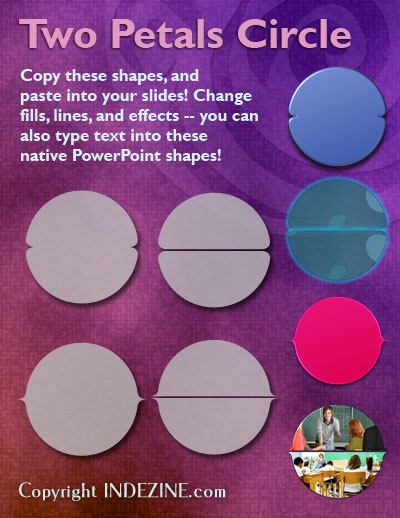
These Two Petals Circle graphics are part of our Petal Circles series that add stylized tips to your circle shapes. These two tip styles: Rounded and Pointed make your circles look different from conventional segmented circle graphics. They also break the monotony of text heavy slides, and help you explain concepts better to your audiences. Using these circle shapes also convinces your audiences that you care enough about them to make the slides look appealing and comprehensible. What’s more, these shapes are also so much fun to use!
Buy and download these slides now.
Filed Under:
Presentation Bank
Tagged as: Design, Graphics, PowerPoint, Presentation Samples
Comments Off on PowerPoint Concept Slides: Two Petals Circle
Axis Labels, as the name suggests are labels for the Categories and Values on your chart axes. So where do these labels come from? Category axis labels reflect the Category names within your data (typically within an Excel sheet). Values on the other hand are determined by PowerPoint based upon the maximum value in your data — the minimum value is always set to zero. Of course you can change the Minimum and Maximum values if you want.

Learn how to change the axis labels in PowerPoint 2011 for Mac.
Filed Under:
PowerPoint 2011
Tagged as: Charting, Office for Mac, PowerPoint 2011, Tutorials
Comments Off on Learn PowerPoint 2011 for Mac: Changing Axis Labels
Microsoft and the Office logo are trademarks or registered trademarks of Microsoft Corporation in the United States and/or other countries.