 (No Ratings Yet)
A stock chart is a price chart of a specific stock, plotted over a time frame. Stock charts created in PowerPoint can be both candle or stick charts, or both at the same time. In case they use both candle and stick shapes, they are called candlestick stock charts.

Learn about stock charts, and how you can use them within PowerPoint.
Related Posts
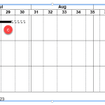 Gantt charts are among the most useful visualizations you can use to show a process with concurrent tasks. Such tasks are not easy or even practical t...
 Technically, yes, you can create a bar chart in PowerPoint and go through some hoops and workarounds to make it look like a Gantt chart. However, let’...
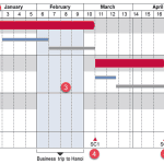 There are charts of all kinds that can be seen in business reports, presentation slides, website pages, books, and even on social media. However, the ...
 In a previous article, we looked at waterfall charts. A simple waterfall chart contains just one parameter, represented by one series in your data. Su...