![]()
This is the print version of this page. All content is copyright Indezine.com 2000-2026.
![]()
Thoughts and impressions of happenings in the world of PowerPoint and presentations, continuously updated since 2003.
See Also:
PowerPoint and Presenting Notes
PowerPoint and Presenting Glossary
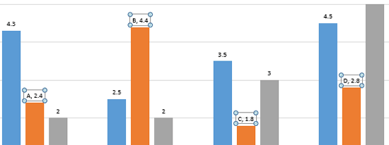
Charts that include elements spaced apart look better. You can increase the Gap width so that there is enough space between the categories. Also, you can adjust the space between the individual Data Series within a category. By default, charts in PowerPoint 2011 do not show any gap between the individual Data Series within a category.

Filed Under:
PowerPoint 2011
Tagged as: Charting, Office for Mac, PowerPoint 2011, Tutorials
Comments Off on Learn PowerPoint 2011 for Mac: Adjust the Chart Series Overlap
Imitation is the best form of flattery – and that motto will help you create charts that are so much better! Before we proceed, let us discuss whether imitation is stealing? The answer to that question is that you must only look at imitation as a source of inspiration. And make sure that you leave your own imprint to whatever you create. You can do so by investigating the chart content well, making changes that work for you, and improvising all the time.

Filed Under:
Charts and Diagrams
Tagged as: Charting, Design, PowerPoint, Tutorials
Comments Off on Reverse Engineer Charts
An organization chart in PowerPoint 2013 is not a separate option on the Insert tab of the Ribbon — rather it is just one of the many variants of SmartArt graphics you can insert in your slide. An organization chart graphically represents the management or hierarchical structure of an organization. If you want to illustrate the reporting relationships in your company or organization, you can create a SmartArt graphic using the Organization Chart variant.

Learn how to add an organization chart in PowerPoint 2013 for Windows.
Filed Under:
PowerPoint 2013
Tagged as: Org Chart, PowerPoint 2013, SmartArt, Tutorials
Comments Off on Learn PowerPoint 2013 for Windows: Insert an Organization Chart
The Data Labels that you add to your PowerPoint charts can be enhanced by exploring Format Data Label options. These Format Data Label options include Label Options to edit the content, the position, and the format of Data Labels, as explained in this tutorial.
Filed Under:
PowerPoint 2013
Tagged as: Charting, PowerPoint 2013, Tutorials
Comments Off on Learn PowerPoint 2013 for Windows: Label Options for Chart Data Labels
After inserting a SmartArt graphic in PowerPoint 2013, you can add animation to your SmartArt graphic. You’ll discover that the entire graphic animates at the same time. It may seem that you have no control over animating individual SmartArt shapes, but that’s not entirely true since PowerPoint 2013 for Windows does provide some control over animating SmartArt shapes. In this tutorial, you’ll learn where to find those options, and how to use them to animate a SmartArt graphic with more control.

Learn how to animate a SmartArt graphic in PowerPoint 2013 for Windows.
Filed Under:
PowerPoint 2013
Tagged as: Animation, PowerPoint 2013, SmartArt, Tutorials
Comments Off on Animate SmartArt in PowerPoint 2013 for Windows
Microsoft and the Office logo are trademarks or registered trademarks of Microsoft Corporation in the United States and/or other countries.