![]()
This is the print version of this page. All content is copyright Indezine.com 2000-2026.
![]()
Thoughts and impressions of happenings in the world of PowerPoint and presentations, continuously updated since 2003.
See Also:
PowerPoint and Presenting Notes
PowerPoint and Presenting Glossary
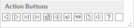
Once you place Action Buttons on your slide in PowerPoint 2013, you can make them do all sorts of actions when clicked. What sets Action Buttons apart from other shape types in PowerPoint is the iconography they contain. For most users, an icon such as a leftwards arrow indicates moving to the previous slide and a rightwards arrow does indicate progressing to the next slide. Another advantage of these icon-equipped Action Buttons is that they are language independent, and can work very well in multi-language and international presentations. In this tutorial you are going to explore the different types of Action Buttons, and their default behaviors.
Filed Under:
PowerPoint 2013
Tagged as: PowerPoint 2013, Shapes, Tutorials
Comments Off on Learn PowerPoint 2013 for Windows: Default Behaviors for Action Buttons

Damith C. Rajapakse is a faculty member at the School of Computing, National University of Singapore. He has a deep interest, and many years of experience, in presentation design and the craft of software building. He is the project mentor for the PowerPointLabs project and other similar efforts.
In this conversation, Damith discusses the Animate in Slide options the currently free PowerPointLabs add-in for PowerPoint.
Geetesh: Your Animate in Slide option does something that was very painstakingly slow in just an instant – can you explain this feature and what motivated you to automate this?
Damith: When presenting a detailed slide, moving a shape (e.g. an arrow) around the slide in multiple steps can help the audience follow your explanations. Here are some examples:
As you pointed out, creating such an animation used to be a painstakingly slow process. We thought it was time we did something about it. With the PowerPointLab’s Animate in Slide feature, all one has to do is to select the shapes and click a button. It takes just a few seconds only and the results are always perfect, which was not the case when using the traditional method.
Geetesh: Animation does receive a lot of criticism and people complain that it often distracts the audience rather than holding their attention. However, there’s a purpose behind animation. How much animation is sufficient and when do you know that you have crossed the limit?
Damith: We are here because our ancestors were good at detecting movements, which helped them to detect dangers quicker, which in turn helped them survive longer so that they could pass down their genes. That is why we are hardwired to pay attention to moving things, so much so that we cannot ignore movements even if we wanted to. It is in our genes. That is also why animation can enhance or ruin the audience’s experience, depending on how it is used in a presentation. For example, animation is a great tool for catching and directing audience attention (as in the example animations above), but when used excessively, it becomes a distraction. When used for directing attention, it should last no longer than it is enough to catch the eye of the audience.
In addition, we can use animations to convey meaning. For example, the animation below (also created using PowerPointLabs) shows how a bad cell embeds itself among good cells, which may be easier to understand when animated like this than when showing a static diagram only. When using animations to convey meaning, we should still make it as short as possible, and strictly use only animations that convey the right meaning. An animation that neither directs attention nor conveys meaning has no place in a presentation.
The views and opinions expressed in this blog post or content are those of the authors or the interviewees and do not necessarily reflect the official policy or position of any other agency, organization, employer, or company.
Filed Under:
Interviews
Tagged as: Add-in, Animation, Interviews, PowerPoint, PowerPointLabs
Comments Off on Animate in Slide: Conversation with Damith Rajapakse
In PowerPoint 2011, you can change the direction of rotation for text contained within a shape. However you actually cannot find an option to rotate your text within a shape by 180°! Funnily enough, there are options called Rotate to 90° Counterclockwise which actually rotates your text by 270° and Rotate to 90° Clockwise which rotates your text by 90°. So, you can rotate your shape text by 90° and 270°, but there is no option to rotate your text by 180°.

Learn how to rotate text 180° within a shape in PowerPoint 2011 for Mac.
Filed Under:
PowerPoint 2011
Tagged as: Office for Mac, PowerPoint 2011, Shapes, Tutorials
Comments Off on Learn PowerPoint 2011 for Mac: Rotate Text 180° within Shapes
This is part of our “sometimes” series on how you can explore design treatments for callouts within your slides. And here’s another very interesting and organic sample to share. The fact that this sample does not just try to appear hand drawn, but that it actually travels all the way on the hand drawn path is what makes this stand apart.

Even the callout shapes look so organic and different. Notice that you have a regular speech balloon, simple arrows, even lines, and also a very different callout that has been created using parentheses. Amazingly enough, the hand drawn look provides a unity to the entire design.
And of course, the fonts used are amazing too. No two fonts are the same, and that would seem like throwing every design rule book in the trash. But again, this mishmash works here!
This graphic was on the cover of British Airways’ inflight magazine Highlife for the month of February 2013.
See Also: Callout Sample 01: Arrow Pointing to a Map | Callout Sample 02: Colored Callouts | Callout Sample 03: Curved, Connected Callouts
Filed Under:
Case Studies
Tagged as: Callouts, Design, Graphics, Opinion, PowerPoint, Presentation Samples
While creating PowerPoint slides, you will invariably add pictures — and of course you can also add pictures in Word documents or Excel sheets. If you are using any of these programs on a touch device such as Microsoft Surface, this process works just like how you would insert pictures on a desktop version of PowerPoint 2013. The differences between working within a desktop and a touch environment become a little more pronounced when you want to do something simple with your pictures — like cropping them. Yes, cropping can make your picture more pertinent by removing areas that may be not required. In this tutorial, we’ll show you how you can crop a picture within PowerPoint 2013 on a touch device such as Surface — the process works in the same way on Word and Excel versions of Office 2013.

Learn how to crop pictures within PowerPoint 2013 on a touch device.
Filed Under:
PowerPoint 2013
Tagged as: PowerPoint 2013, PowerPoint Touch, Tutorials
Comments Off on PowerPoint 2013 on Touch: Crop Pictures
Microsoft and the Office logo are trademarks or registered trademarks of Microsoft Corporation in the United States and/or other countries.